Fortr3ss
Branding | User Experience Design | Android App and iOS App
Fortr3ss
Fortr3ss uses a user’s voice signature to encrypt their
personal information and data.
Deliverables
→ Branding
→ User Experience Design
→ Android App and iOS App
Intelligent
Biometrics for People
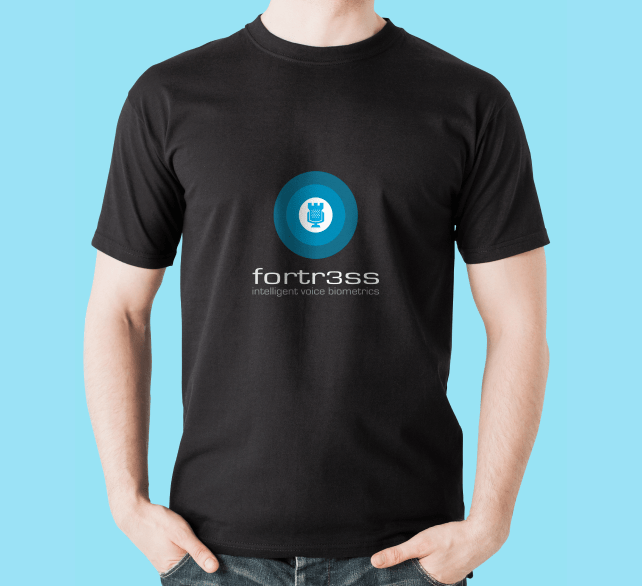
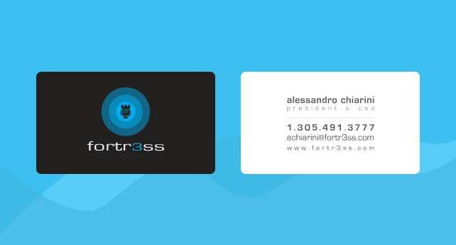
Fortr3ss uses a user’s voice signature to encrypt their personal information and data. Providing security at a scale no other platform did was the key x-factor for fortr3ss. Therefore, we decided to use it as a corner stone for creating a unique identity system.
The Microphone
and the castle =
Voice and security
Your Voice
Is The Password
Bringing the voice based encryption platform to the people in a visual language that was understandable and relatable in the form of android and iOS applications.
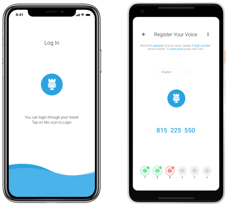

Generating a digital voice signature
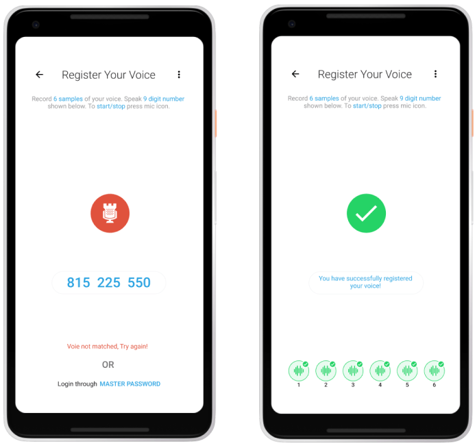
Every person has a unique voice signature, no matter how similar they sound to another person. Fortr3ss records samples of the user’s voice by using unique paraphrases and combine all the information to generate a voice signature.
Giving Effective Feedback To The User
In cases of success or failure in completion of a task the user is provided feedback, by giving a green signal on success and red signal on failure and a message on what to do next.
The App Interface
The interface of the application was designed by paying attention to
user mindset and familiarity, by using the best practices and
guidelines for both android and iOS platforms.
user mindset and familiarity, by using the best practices and
guidelines for both android and iOS platforms.
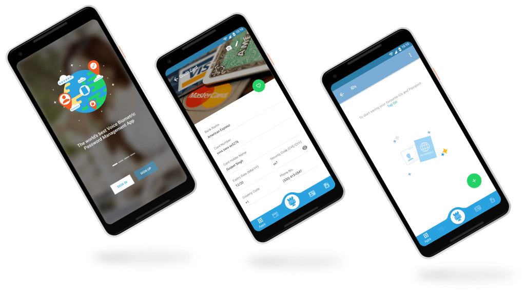
Password manager, wallet and app center
Storing everything in one place can be confusing for the user, therefore, we created different places for storing different data, all of which required a unique paraphrase every time the user accessed it to keep hackers away.

Building A Robust Design System
Good design happens through consistency in color and type

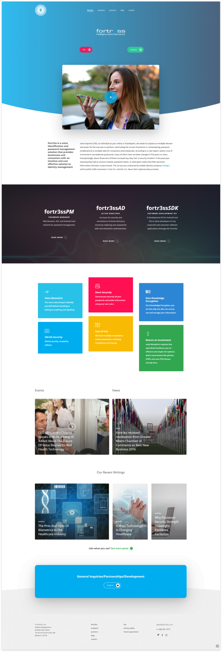
Spreading The Word Through Web.
Since we had done the branding and application design for Fortr3ss, we
became their obvious choice when they decided to get a website done for
promotion and attracting more people. The purpose of the website was to
give an overview of what the app was all about and how things worked.
