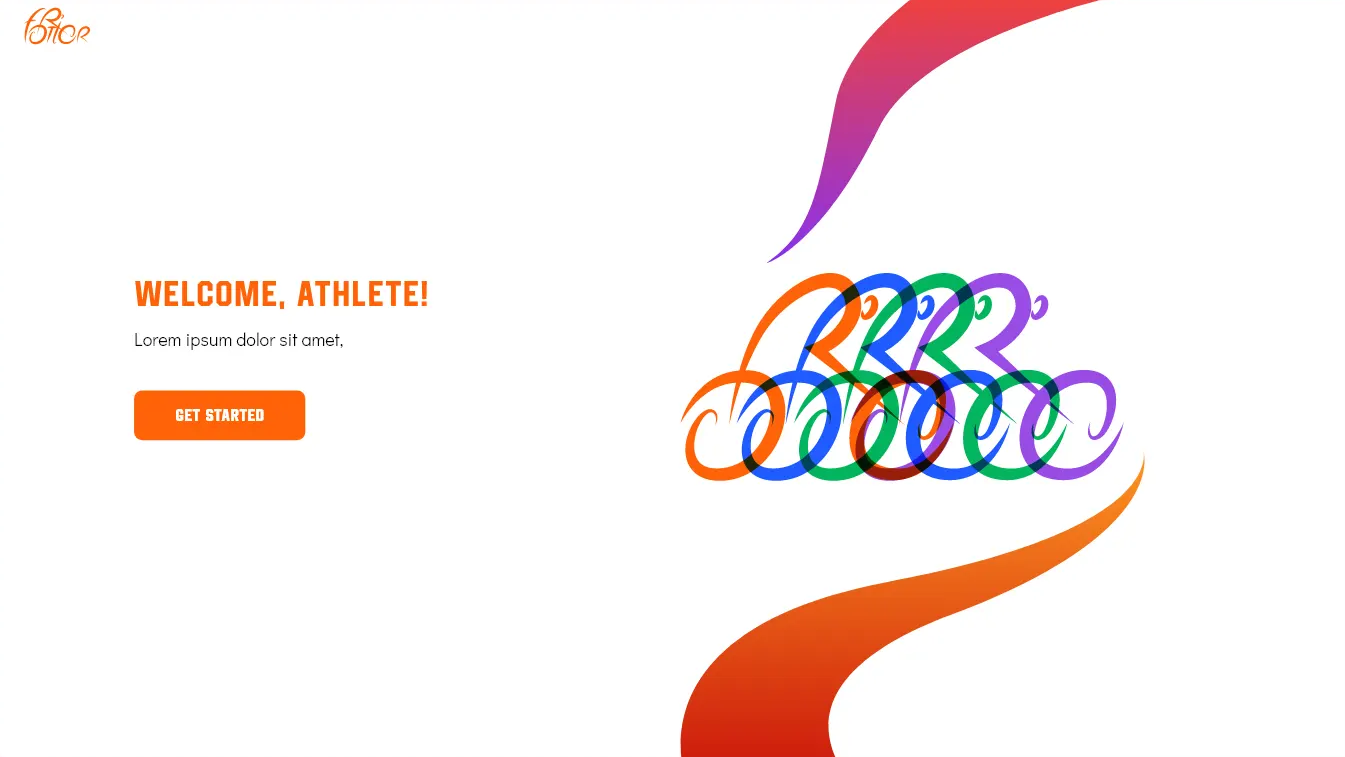
An allrounder fitness app for enthusiasts, athletes and coaches
Fortior
An allrounder fitness app for enthusiasts,
athletes and coaches
Deliverables
→ Brand Identity Design → Web Platform
Logo Ideation;
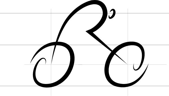
Inspired by the Olympics moto “citius altius fortius” translated to “faster higher stronger”, Fortior provides the essential tools for identifying and developing core strengths in cycling athletes. Using this idea we wanted to design a logo which represented the athlete and their core strengths like speed, agility and quickness.
We sketched out number of logo options based on our influences.
After many options and iterations we decided upon the cyclist.
But our client needed the whole logo to have the same style as the cyclist, so we updated the logo to get something that they liked
Color Palette
From the very beginning the client had insisted on the color orange as the primary color. To match the sharp lines and edges of the logo we decided to go for hot orange, synonymous with sports and the color of glowing metal to exude athletic energy from the logo.
Typography
n our research of other fitness apps we observed similarities in typeface choices: Round and geometric. To make the platform stand out from the crowd we decided to use a condensed typeface chiselled at the edges which represented strength and power.
Web Platform
In continuing our journey to create memorable user experiences we crafted a modern, clean and usable product. We removed all the clutter and confusion that complicated charts and graphs might bring for a coach or athlete, making it easy to use and visually rich so that people can spend more time on important things like training and get all the information they need from Fortior as quickly as possible.
Data Visualisation
Workout Builder
Other Components
An allrounder fitness app for
enthusiasts, athletes and
coaches.
We use cookies to ensure that we give you the best experience on our website. If you continue to use this site we will assume that you are happy with it.Ok